
FileMaker Portals Don't Belong on Phones? Not Quite
Overview
A portal is a list of related records shown inside a layout. Many FileMaker developers follow one rule: never put a portal on a phone screen.
That rule holds most of the time. But it is not really about the portal. It is about what the portal is carrying.
Where the rule comes from
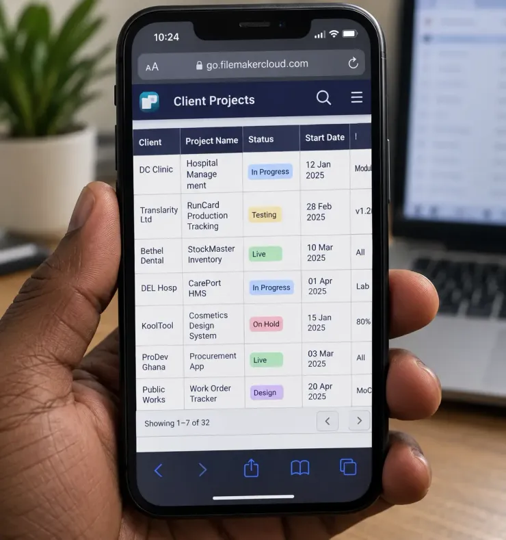
A portal with six columns squeezed into a phone width forces tiny text and thin rows. A thumb cannot tap that safely. Reading it means scrolling sideways, and that feels wrong on a phone.
So developers learn to avoid portals on phones, full stop. That is a fair shortcut most of the time. But it skips the real question.
What actually breaks it
- how many columns the portal shows
- how wide each column needs to be
- how tall each row is
- whether the row forces a sideways scroll
A portal with one column and a tall row works fine under a thumb. The user sees one clear line per record, taps it, and moves on. No tiny text. No sideways scroll.
Before you stop using one
Ask what the portal needs to show on a phone, not on a desktop. If it is one piece of information per record, a single column portrait portal will work.
Ask if the row height gives a thumb enough room to tap without missing. Ask if the user needs to compare columns side by side, or just needs to open one record.
If the answer is compare, build a desktop layout for that task. If the answer is pick one and open it, the portal was never the problem. The column count was.
Do you avoid portals on phones by habit, or by checking the column count first?
Recent comments
No comments yet.